I'm like a pencil;
sometimes sharp,
most days
well-rounded,
other times
dull or
occasionally
broken.
Still I write.
j.g. lewis
is a writer/photographer in Toronto.
Month: November 2017
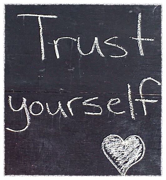
Trust is a hard thing to do.
Trust, in its most basic form,
begins with you.
Trust yourself.
You will know what to do.
11/30/2017 j.g.l.
Look closely.
You may have to — depending on which screen, tablet, or device you are reading this on — because how it is presented is not how it was intended.
Things are not always as they appear.
It’s not like it used to be, where at one time the size of the text you read to obtain information and entertainment was consistent, but lately you may even have to squint to stay informed.
It used to be about the pica.
You know, the pica? Sure you do; the pica was the standard unit of measurement for the copy you read in newspapers, magazine, books. Okay, it was more industry jargon, but you, in selecting the size of font to write or print a document, made use of this measurement.
There are a dozen points to one pica, thus when you choose 12-point type, you are selecting a measurement of one pica. You get the point. As typography changed through the years, and computers replaced traditional typesetting in the 1980s, the sizing and measurement was altered slightly.
Published documents used to deal with standard sizes. Whether it was legal or letter-sized stationery, or a broadsheet or tabloid-sized newspaper, the type sizes were consistent. The traditional printed page is now less and less important as much of our reading is done on a screen of some size or another. It makes it difficult, Much of the print we read these days is simply too small.
It is becoming a problem.
When web page designers and companies create sites for the retail or service sector, they are going for a certain look. They want to attract attention and appear different than everything else out there, all the while they are selling something.
The nature of online business is to catch the eye, and in trying to do so with captivating images and layouts they are paying less and less attention to the written word and how it is read.
All too often they are selecting fonts in point sizes that may graphically look wonderful on the screen they are designed on, but translate to something insignificant when transformed to the reader’s screen
Do you ever wonder why your eyes are tired at the end of the day?
Look at what you’ve been looking at.
I recently flashed through the Apple website on my iphone. I even have the larger screen of a recent model, and still I had to “pinch” the screen at one point to increase the text size. I was unable to do so with two of the banking apps I scrolled through. I actually opted to make a transaction on my computer because the information I required was not easy to comprehend on the mobile app.
I’m quite used to reading type, and I wear progressive lenses in eyeglasses to aid my vision. Still I was having difficulties.
Often I find a virtual page has been designed with a larger type in some sections, but some of the sub text was almost incomprehensible.
Yes, you can increase the size of the text size in the settings on your mobile device, but those settings increase the overall text on the screen, and that is not always required.
Most times it is not required, nor should it be.
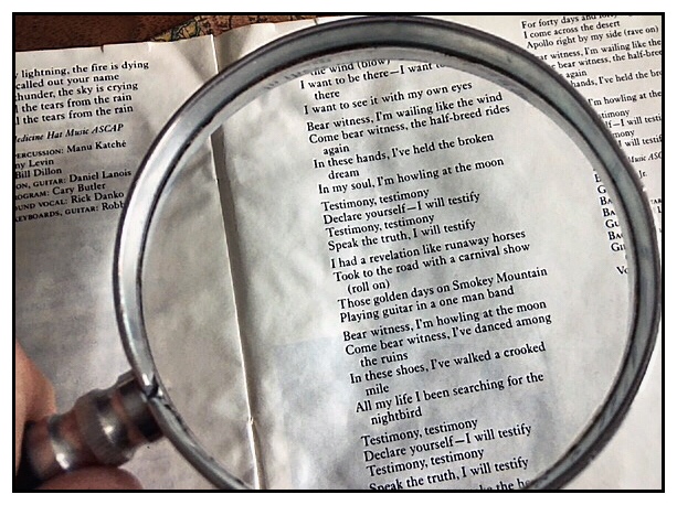
Micro-sized text is not limited to computer-related screens. Forever we have dealt with tiny type on a package’s ingredients, cooking instructions, or the disclaimers and finer points to a legal contract. Do you remember how difficult it was reading the liners notes and lyrics on Compact Discs?
There were times you even needed to pull out the magnifying glass.
It’s a shame that, sometimes, you might need to do the same thing on a mobile device.
Image: Testimony ©1987 Robbie Robertson
Posted on November 28, 2017 by j.g.lewisLeave a comment
What do you put off doing for personal reasons, or just because?
What don’t you get around to because of all those things you continue putting off?
Why would you let the undone prevent you from doing what needs to get done?
What do you deny yourself as you seek redemption, salvation, or a decent night’s sleep?
11/28/2017 j.g.l.
